Sunday 29 March 2015

Colour Theory

I have been looking into colour theory and the associations that revolve around colour.

Usually a colour is associated with a look or feeling because of a majority of people experience that particular feeling when in contact with an object of that colour.

For example, the human heart is red and pumps blood. This is associated with feelings of love because of the quickening of pulse or the dull ache inside when hurt in love. Therefore the colour red becomes associated with the feeling of love. Pink is lighter shade of red and therefore is also associated with love and both colours are used in the adversing of love based holidays such as Valentines day.

Colour harmony seems to be based on what we know and see in every day lives. This tends to be non man-made and natural things like a pink plant with yellow insides and green leaves.
 photo lupinus-beryl-viscountess-cowdray-salmon-pink-flower-plant-in-spring-60165_zpscbzh1vzf.jpg
Image found at : http://www.imageflora.com/images/lupinus-beryl-viscountess-cowdray-salmon-pink-flower-plant-in-spring-60165.jpg

 This colour combination is not unpleasing or shocking to the eye, therefor the colours go well together. Colour associations forms without our brains even knowing it.

This raises questions in my mind about how we choose our favourite colours and why. My favourite colour is green and I believe it is largely down to the fact that it is also my mothers favourite colour and growing up, the house was decorated with large amounts of green. I was exposed to the colour alot during childhood and I feel as though this has influenced my decision.

Jobs

I have been searching constantly for a part time job for the past 2/3 months. After going to several interviews I have managed to secure a position as a coffee barista in the train station. I'm finding juggling my work with the exhausting hours very difficult over the easter break as I am up at 3:30am in the morning to be at work for 5am. My evenings are cut short due to tiredness and in the past this is when I would do all my work. I will now have to make an effort to spend a one of my days off catching up with logbook and journal work.

Despite securing this job, I applied for the position of a photographer at Revolution Portraits in Norwich city centre about 3 months ago, I heard back from them 2 weeks ago and attended the interview regardless of my current employed status. They have invited me back for a second interview in a weeks time. The trial will consist of assisting the current photographers and seeing how I react with their clients. I am really greatful for an opportunity like this and really hope I get the job in the long run as they would be taking me on full time after university has finished. Despite only being at the coffee job for 2 weeks now, it would definitely be worth enduring the awkward 1 weeks notice in order to secure a full time job in the photography industry.

Mid Year Review thoughts.

I found the idea of having 3 of my fellow students looking over my work very daunting at first but I think the notes will definitely help me improve my work.
I can now go back through my previous posts and add to them things I didn't see previously while bearing it all in mind for future work.
There are definitely some very helpful notes on my feedback sheet such as making my moodboards clearer and adding things to my analysis of images which I was previously oblivious to.

Mid Year Review notes.

LO 7 - Areas for development

Add visual references of Paolo Roversi in your 'shoot ideas' post.
Please explain your definition of 'freshness' and how it ties in visually.
On the Edward Steichen post say how you can use these images to develop your own practice as well as what you like about them.
Reference back to research when evaluation your own shoots.
In your summer shoot, explain why you used shells.

Strengths - 

In the beginning there is a god link between visual research and your own images.


LO 9 - Areas for development

Consider looking into colour theory
Look at lighting for spring/summer and consider changing overlay in shoot 5 as you have lost your highlights.

Strengths - 

Emailing people for headpieces
Good organisation of creative team
Looking at where you want to go in the industry.


LO 10 - Areas for development

Think about naming your styling moodboards to make them clearer
Be more specific about what you want your lighting to do and explain how this affects your images.

Strengths - 

Forsight into planning and potential problems.
Good collaborations with fashion students.


LO 11 - Areas for development

Talk clearly about your visual opinion to each season
Broaden your research eg, look at landscapes and still life.

Strengths - 

Depth to research


LO 12 - Areas for development

Explain what you like about your own images and why?
If it does not influence the next shoot, put it in your journal.

Strengths - 

Good use of critical evaluation.

Friday 20 March 2015

Winter edit process.


The first image is an example of what this image looked like after skin retouching but before the fill layers. To get to the final image it was actually quite a simple but effective process. Using a blue and a white fill layer at different opacities I managed to create an icy fog over the image. I then tweaked the contrast to create a stronger contrast between the snowy highlights and the moody shadows. This was a very simple process but extremely effective and much easier than the autumn edit I had to as I really focused on getting everything right in camera this time.

Monday 16 March 2015

Josh Olins inspired by Richard Mosse?


Richard Mosse - Infra


Josh Olins - Balenciaga campaign.

When scrolling through Josh's website I came across his Balanciaga campaign and immediately thought of Richard Mosse's Infra images.
I'm not sure how I feel about the fact that it appears that Josh has ripped off Richards images. The infra set of images are some of my favourite images ever and they mean so much to me, I feel like I really understand them and the pain felt in the Dominican Republic of Congo at the time the images were taken. But with Josh's images, while I'm happy that the unusual and beautiful aesthetic style has caught on, I feel as though the use of this in fashion imagery has now reduced the meaning of Richard Mosse's infra images.

I'm wondering if the campaign was shot on Kodachrome film or on digital and edited to look this way? I'm pretty sure it was the latter though, and unusually, I think this angers me. As a retoucher, manipulating and editing images is something I take pride and joy in but for some reason, I really do not like the fact that Josh Olins has created this campaign in 2014 that has basically ripped off the hard work and many years that Richard Mosse put into photographing in the Dominican Republic of Congo in 2012. This causes such a conflict inside of me.

Fashion Student Collab

 I attended a fashion meeting at uni a few days ago. The aim of the meeting was to pair up designers with photographers and shoot their final collection. The shots would be used in promotion of it during their final term at uni.

I presented a presentation of my previous photography and few ideas that I felt might appeal to the fashion students. I had a lot of interest in my pastel geometric idea but have chosen to work with a student named Sami Hogg.


Moodboard for shoot with Sami Hogg


Finding a model that fit Sami's vision with such short notice til the shoot which was a week from when we first met as this was the only studio space available, was extremely hard. After days of asking many people and compromising on hair length as Sami originally wanted a short haired model, we managed to book a student with previous experience of modelling who fit Sami's vision perfectly. We have communicated over every decision in the project so that the shoot benefits not only her but myself too.


Tuesday 10 March 2015

The industry.

After having several lectures from many successful photographers and retouchers, the general consensus for getting into the industry is through assisting. Through assisting you meet the right people and you make connections and generally end up being in the right place at the right time.

As well as assisting another way to get exposure it to submit to magazines such as Institute who are known to publish many up and coming fashion and portrait photographers.
Also to submit to competitions like the many D&AD briefs and Sony World Photography awards.
Attending events such as guest lectures and the AOP awards ceremony put you in the right place at the right time and enable you to meet other working professionals and strike up a relationship with them.

Approaching agencies are a great way to find a manager or a booking agent who will help you out with exposure and exhibitions and finding work.
Going freelance is one way to increase your connections and portfolio also.

All of this applies to several routes in the industry such as being a photographer, being a retoucher, becoming an agent etc.

Comparing my camera.

I use a Nikon D7000 camera with a 50mm lens for the majority of my portrait shoots. I'm going to compare this to other equipment that the university has to offer to see which would benefit my practice the most.

Nikon D700 VS Canon 5d mark II


Nikon has 16.2 megapixels while Canon has 21.1
Nikon sensor size is 23.6mm x 15.6mm while Canon is full frame.
ISO sensitivity is the same.
Nikon has 6 fps where as Canon only has 3.9 fps.
Nikon has 39 point AF system where as Canon has 9.

I think it is obvious that just by comparing a few tech specs like the above that the Canon produces the better quality image over all. More megapixels and a full frame sensor opens up endless possibilities for the future of the images captured on it. They can be blown up as big as a room and the detail in the shots would be intense. However, when it comes to moving image the Nikon seems to come out on top. Both cameras have ideal qualities and I will bare this analysis and comparison in mind the next time I am shooting.


Lenses

After recently learning that 50mm lenses are not always the best lens for portrait photography, I have decided to do some research on different lenses and what is appropriate for the kind of work I want to produce.

Naturally prime lenses are great for portrait photography as they have a wider maximum aperture for shallower depth of field and are often better quality than zoom lenses.

Canon.co.uk posted the following specifics about two of their lenses:


Canon EF 135mm f/2L USM

A wide aperture, fast-focussing professional telephoto lens.
The EF 135mm f/2 L USM is a fast, lightweight, high-quality telephoto lens. It is the ideal tool for capturing indoor sports in low-light conditions and for shooting portrait photography.

  • Large f/2 aperture
  • Fast, quiet autofocus
  • Super Spectra coatings
  • L-series construction and optics
  • Circular aperture for soft bokeh
  • Integration with E-TTL II flash system
  • Soft case and lens hood

Canon EF 85mm f/1.2L II USM

An extreme portrait lens with a very fast maximum aperture and swift focusing.
A professional short-telephoto lens, precision-made for low-light shooting and those situations where extremely shallow depth of field is required. Perfect for creative portraiture.

  • Extreme f/1.2 maximum aperture
  • Fast, quiet autofocus
  • Super Spectra coatings
  • Circular aperture for smooth background bokeh
  • Integration with E-TTL II flash system
  • Soft case and lens hood

I think both of these lenses are great choices for portrait photography. I have used an 85mm in the past to shoot this:


And I was extremely happy with the outcome! The focus was crisp while the depth of field was shallow. The only problem I had was the space I had to take between the lens and the subject. This will only increase with the 135mm lens so I must bare this in mind in the future.

The 85mm would be very useful in a location shoot as I could use the f1.2 to my advantage and blur out anything that was distracting where as the 135mm would flatter the models most.

A lens that would definitely not be appropriate would be anything over 135mm, so for instance the 

Canon EF 200mm f/2L IS USM or the Canon EF 400mm f/2.8L IS II USM


The distance needed between the lens and the subject would not be realistic for shooting in a studio environment. Nor on location as the photographer would just be too far away and there could be obstructions like trees in the way. These lenses are telephoto lenses and much better used in sports and wildlife photography, not portraits.

Survey

I conducted an online survey into how people with Seasonal Affective Disorder perceive different seasons through the use of colour and feelings.


Rus Anson


I recently discovered Rus Anson through PDN30.com. His entire portfolio is basically him playing with colour in different ways. He differentiates through pastels and pale smokey colours to block bright prime colours. He does keep a consistent vintage feel throughout his work though. I really like the way he plays colours off each other. For instance in image 1, there are no colours that are particularly loud or stand out but none of the colours mould into one either. In image 2 he uses a burst of pink/orange in the models hair to attract attention but it still fits in with the pale and pastel theme he has going on. And in image 3, he plays pink and a yellow/orange colour off each other, colours that normally would not look right together but by keeping the triptych tones controlled, he pulls it off.

Crit feedback.

In last weeks Crit, I presented an image from spring, summer and autumn.
The main feedback points were:

  • Possibly desaturate some of the images as this will help communicate the feelings more.
  • Work on colour control and tonality of the models skin etc
  • Try new crops when taking the shots.
  • Work with a longer lens - 135mm.

Andres Delara


I have mocked up a possible lighting diagram for the above two shots. It looks as though the background is lit with two lights. There is a definite hair light on the lower image and the gradual shadow on the model right hand side of face looks as though it has been lit with a beauty dish or a soft box with a honey comb from one angle.


When looking at Andres Delara's work in relation to my own, I can see that his is much more style orientated than mine. His lighting holds strong crisp contrast as well a bright highlights where as mine hold contrast but is not quite as crisp and snappy as his. This is something I'd like to work on in the future. I think this is down to the texture in the background of my work, it is holding back the potential for crisp outlines. Delaras work boasts strong composition and interesting subjects with crops that almost always cut off the models head. After receiving crit feedback that I need to be more adventurous in my cropping, I think I can learn alot from Delara. I really like the way that the models in his images stay fierce throughout the majority of his images. They permanently 'smize' or have a look of aggression or confusion on their faces. While this is not appropriate in some situations, in the majority of fashion portraits, this comes across and strong and empowering and as though the model is in control of the shot. To achieve the same standard of work as Andres Delara I will test out some of the university equipment as it is much better quality than mine. Specifically I will be using a Canon 5d Mark 2 with 135mm lens for my next shoot as this was recommended to me by a tutor and it is quite obvious that Delaras work is shot on digital.


Wednesday 4 March 2015

Moving Image.


My original intention for a moving image project was to shoot clips from each of the 4 seasons shoots and compile it all together to create a preview for the project. However, during the heat of each shoot I forgot to video all but a two clips of of the final Winter shoot. I have however, put my past video editing experience into practice and created a basic video.

I went with the cold winter theme and edited the shots to a blue/steel colour and added a bokeh effect so that it looked as though it was snowing or as if it was a bit of cold lens flare. The music is 'Arrival in Nara' by Alt-J and is very slow and calming to fit the cold, slightly lonely/airy feel to the video.

Tuesday 3 March 2015

Calendar


I have decided to create a calendar in order to stay on top of tasks. The calendar shows main events that I know will be happening weekly such as shoots, workshops, crits and lectures. There are a few personal events added to the calendar as they effect my ability to work or attend university on certain days. It is my aim to shoot once a week in order to achieve the final successful 20 images for the project. I have included a few deadlines such as the hand-in deadline, my own personal deadline of finishing my portfolio and a few others. As time goes on and the events change or get added, I will update the calendar and repost the new one to my reflective journal. This is so my time planning will be up to date and effective in helping me finish the project successfully.


Monday 2 March 2015

Dove: Thought Before Action.


While catching up on all the recent retouching news, I came across this campaign by the soap and skincare company, Dove.
In the video it explains how they have 'tricked' retouchers by making them think they are downloading a 'skin glow' effect photoshop action. What they're actually downloading is an action that reverts an image to its original untouched state. This is to basically force retouchers into feeling guilty about photoshopping models bodies, well thats my opinion anyway.
This video has really angered me. While it is unquestionable that the woman in the video is beautiful and her body is also beautiful.. she is beautiful retouched and also un-retouched. Lots of people have different standards of beauty and this video seems to blame the 'unrealistic standard of beauty' that is causing an uproar in the media at the minute on graphic designers, retouchers and art directors? When surely it is not a single persons fault at all. Retouchers simply uphold the standard of beauty that is common in todays media when working. This is in order to be successful as a professional and because it is what is commonly perceived as beauty. The perception comes from somewhere originally but it is not soley retouchers fault that womens bodies are more often than not, retouched to be made skinnier.
As it turns out, http://www.popphoto.com/news/2013/03/dove-releases-photoshop-action-to-undo-skin-retouching explain that the action is more or less rendered useless when working with multiple layer files (so with any professionally retouched file... ever.) and it appears its all a blaming ploy by Dove. Their experiment never really took off the ground in the first place for them to even produce a video that puts out to the consumer world and its audience the 'facts' behind retouching.
I honestly find this absolutely appalling. It is, in short, blaming retouchers for the misconstrued idea around women's bodies in todays media when there are actually 1000 other factors that contribute to the issue.

Not to mention the fact that their previous campaigns that promote 'real beauty' have been accused of being extensively retouched in the past.

Textiles Exhibition.


Tonight I attended the Year 3 Textiles exhibition. It was a really great opportunity to see what they're creating. Normally when I think of collaborating with students, I immediately think of the fashion students but really, as a portrait photographer, accessories are really all I need in a shoot so collaborating with a Textiles student would be a better option. I have contacted one particular student in hope she will work with me on the next set of images.

Hahnmuehle Lecture.


Todays lecture/workshop was given by Heidi at Hahnmuehle. We were told all about the different papers that they manufacture for portfolio's and prints. We were given samples to look at and take away. I think having Heidi come in was a great opportunity as she has offered the group 25% student discount which helps me lean towards using their company for prints.
I am currently debating having a digital portfolio rather than a physical one for various different reasons but Hahnmuehle are now a company I am also debating.

Artist statement Lecture.

Todays lecture about writing our Artists statement has kicked my head into gear. There is alot of research work apart from Visual Logbook work that I need to complete. I will spend the next few days sorting out a schedule and a list of things I need to get finished.

Sunday 1 March 2015

The Print Space.


After hearing so much about it, it was really great to see The Print Space in London in person. Having a member of staff explain all the different printing procedures and types of paper really helped me to understand just how important choosing the right paper for a portfolio is. The Print Space offer relatively cheap prices and complete and utter control over the printing process when you print with them. I particularly like their metallic paper and would definitely consider using this to print on in the future.

Jasper White Studio Workshop.


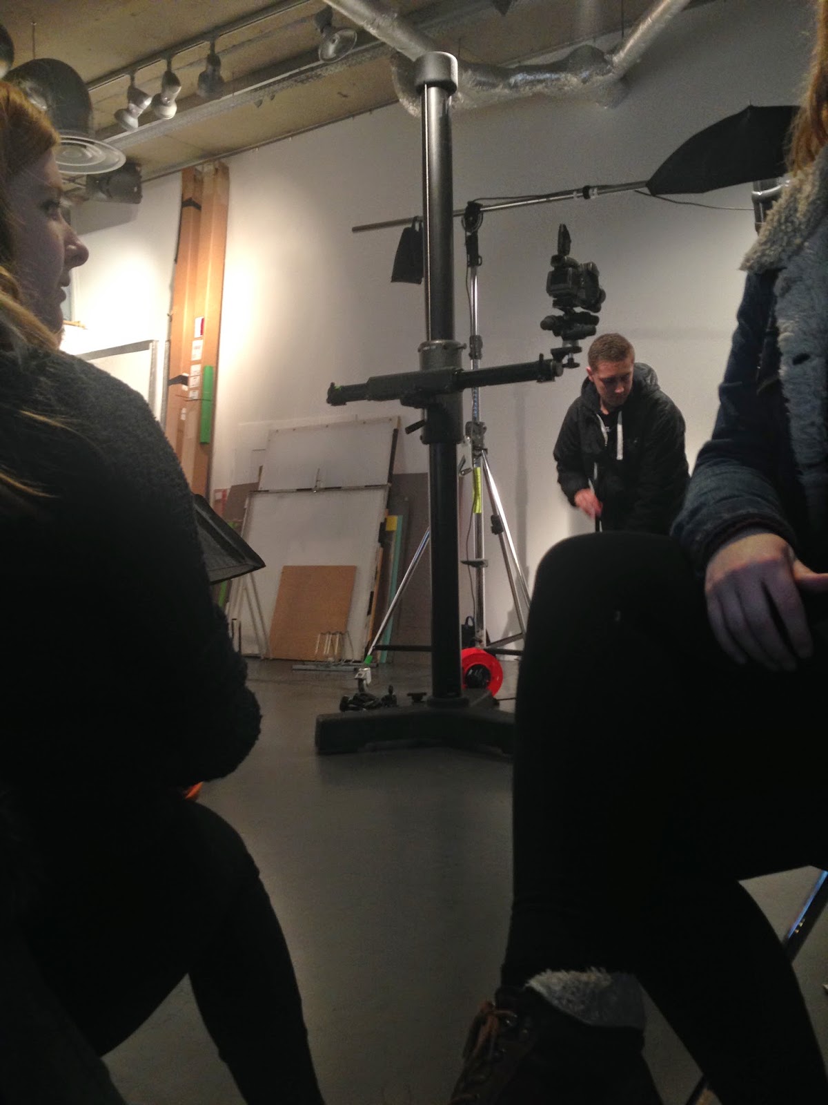
During the most recent uni trip to London we had a workshop in the studio with Jasper White. While the workshop did not teach me anything new, I really enjoyed working with professional standard equipment. I really think you can tell the difference when using expensive equipment like profoto lighting. We were grouped up and each group gave the other groups images to mimic the lighting of. It was a great excersize being able to work with jasper and assist him. It gave an insight into what assisting professional photographers might be like.